Let’s get one thing straight from the start: I love monitoring products. I get really excited when there’s a new one because I think there’s still a lot of space for innovation in this market.
So when I got an email from ApexSQL announcing their new SQL Server monitoring product, I was excited. I clicked on it immediately and looked at the first screen shot in their announcement blog post:
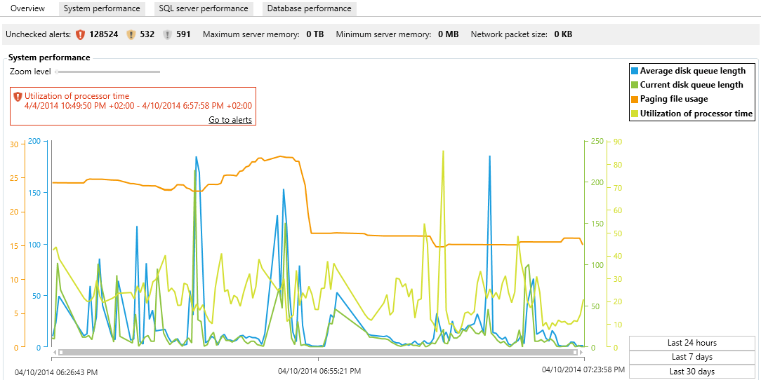
The more things I looked at, the more horrified I got. Let’s take it from the top:
SQL Server isn’t capitalized correctly. I can forgive calling it “SQL server” in a small part of documentation, but on the app’s home page, in the very first screen shot? From a company that focuses on SQL Server? That’s…disappointing.
128,524 unchecked alerts. I get it, it’s probably a demo environment, but that tells me the software is going to spam the bejeezus out of me with alerts that don’t actually matter. I can’t expect a DBA to realistically prioritize 128,524 alerts. That’s not a server problem – it’s a monitoring tool problem, expecting humans to deal with that.
Maximum server memory: 0TB. What the hell does that mean? The server has no memory? That doesn’t even make sense. I’m guessing the SQL Server has less than 1TB of RAM (as most do) but the software isn’t smart enough to change the unit of measure to GB in that case, or display decimal points.
Minimum server memory: 0MB. Again, what does this even mean? What action do you expect a DBA to take based on this headline number? The numbers at the top of the product should be the most important ones, and clearly they’ve had the least amount of thought.
Network packet size: 0KB. Zero? ZERO? Come on, now you’re just making stuff up.
Metrics – average disk queue length. Awesome – leading with the single least useful disk counter. Modern DBAs know that you measure latency, not queue lengths.
And don’t even get me started on the colored lines – I’m red-green colorblind.
With that one screen shot, I simply gave up looking at the product. It might rock, and I look forward to hearing real-life user stories, but in thirty seconds, that one screen shot told me it’s not ready for a real evaluation yet. I don’t like publicly pooping on a product, but this one screen shot is spectacularly bad.
ApexSQL, you can do better.

15 Comments. Leave new
A) Very informative 1 minute assessment!
B) How come I never knew you were red-green colorblind? I’m always bitching about how I can’t see this or that aspect of a UI, as I’m red-green colorblind too. Glad to know I’m not alone!
Bestest regards,
-Kev
Thanks sir! Yeah, I’d heard you were one too – it makes such a difference when looking at up/down dashboards. And network switches, too – man, I have no idea what’s going on on a switch, hahaha.
Ah, I’m glad it’s not just me…
I’ve been right-clicking every pixel of that UI to see if anything could be customized.
What a dissappointment.
Bjorn,
thx for the comment and sorry for the lack of customization
We should be rolling out a lot of customization in the R2 / August release. This is a virgin release and it is a bit light, but we have quite a bit planned. Here is a blog on what is coming up in ApexSQL Monitor R2
http://blog.apexsql.com/whats-next-in-apexsql-monitor/
We’ve got 3-4 major feature releases planned before the end of the year, and we hope to go to 6 week release cycle soon
If you have specifics on what you would like to see specifically, please email support@apexsql.com . We are getting a lot of requests and they are helpful
We are providing FREE licenses for anyone who provides feedback
Just to add to the complaints… what is going on with the time axis?? Show 5/10/15/20 minutes/hours ago or show each concrete hour interval, don’t arbitrarily mark the start end and middle!
Also, in the full screenshot. Why keep repeating “servers” in the actions section?
http://www.apexsql.com/images/screenshots/axMonitor2014/overview/ApexSQLMonitorOverview_2.png
Just put Add / Remove / Refresh as labels and change “actions” to read “servers”.
UX 101: Don’t make me think.
To any database software developer making software, DBAs are obsessed by detail and accuracy, if you ain’t aiming for 100%, then you’re dead to us! Especially when you consider the cost of the DBA software!
With this screenshot, all I would want to know is “is the CPU in line with a historical trend, has it exceeded a ‘safe’ limit I have set, what can I do to fix this problem if it is occurring.” Don’t repeat MSDN, we have MSDN for that 😉
http://www.apexsql.com/images/screenshots/axMonitor2014/overview/ApexSQLMonitorOverview_1.png
Greg,
thx for the comments.
We’ll look at this and update you tomorrow. I’m hoping these are problems with the shots (which are old) and not the software, but we’ll see. In either case, if not fixed, they will be soon. Fully agree with all points
“To any database software developer making software, DBAs are obsessed by detail and accuracy, if you ain’t aiming for 100%, then you’re dead to us! Especially when you consider the cost of the DBA software!” – +1. I’ll be posting this on my G+ stream now
We can even provide custom patches for people who are giving continuing feedback on a daily/weekly basis.
If interested in banging more on this product, we can get you a FREE license key, at minimum. Holla at support@apexsql.com
thx, Brian
Greg,
Thanks for your patience.
The problem with the time axes is not with shots. We arbitrarily marked the start, middle, and end of the time period. This will be fixed. We’ll consider your suggestions to show 5/10/15/20 minutes/hours ago or show each concrete hour interval.
Once again, thanks for your comments.
Millie
Brent,
First, thx for the “tough love”.
Unfortunately, we still have legacy screen shots on the product page from the ALPHA release, which is what you saw. They will be updated tomorrow. Sorry for whipsawing you with obsolete images, posted on our website.
Here is an actual R1 shot
http://fightingceo.tumblr.com/post/87030994984/apexsql-monitor-r1
Some issues are due to the legacy/obsolete/dummy screen shots and actual are OK in the current version we host right now.
Some are issues that will be fixed R2 in August
But all issues you raised should be either fixed already, or will be fixed soon.
We released early but we plan to iterate often. After June, we want to go to a 6 week release cycle. We are also offering a FREE license to everyone who provides us any feedback, good or bad. (Let me know if you want a key 😉 We appreciate the feedback we get. If you have more, we’d love to hear it. This will be to a certain degree a “community” tool – that has its ups and downs 😉
To address all items
*OK in R1 / current version*
High number of unchecked alerts – More a reflection of our test environment and settings in ALPHA. This shot (see link) is more representative of what real user would see
Various metric with “0” for a value – Mostly just dummy data and non functional metrics from ALPHA. See R1 shot
Red Green – R2 will support customization of line colors, and hopefully by R3 custom themes. We will try to change default colors to not require any customization at all, for people with RG color blindness
*Addressed in R2 / August*
“SQL server” – yes, that is on us 🙁
Metrics – average disk queue length.
In ApexSQL Monitor 2014 R1, we show average disk queue length as a single value for all disks on the machine
e.g. disk queue length = 100
This is not useful, we agree
In R2, we split this per physical disk on the machine
disk queue length dick C
disk queue length dick D
disk queue length dick E
etc.
By splitting this metric per disk, users will have more detailed info useful for troubleshooting
Disk latency metric(s) will be in ApexSQL Monitor R2
If you have any additional feedback – good, bad, or ugly – we’d appreciate it
Thanks again
Brian Lockwood
CEO
ApexSQL
Brian – thanks for the response, really appreciate it. One followup question – you’re saying that Disk Queue Length is a valid monitoring metric that’s important enough to show on the home page of a SQL monitoring tool?
Brent – No I’m not saying anything 😉 I’m the one who screwed up the shots. I don’t want to dig myself any deeper.
My sense is the guys felt this had *some* value if it could be improved. If the issue is that you think that shouldn’t even be there, let me run past the guys. You may be right. They’ll follow up and post directly.
We released early so people could poke holes in it quickly. Seems to be working!
thx again – Brian
Yeah, generally speaking, disk queue length is a useless metric:
http://www.brentozar.com/archive/2013/07/on-bobcats-per-100-orders-and-other-spurious-metrics/
Here’s how I like to explain it to DBAs. Say you’ve got a single request outstanding, and it takes fifteen seconds to finish. What would be the queue length during that time? And would storage be healthy?
Now, contrast that with another system that can handle thousands of writes at a time, and they all finish within 5-10 milliseconds. At any given time, what’s your queue length look like? And would storage be healthy?
Because of those scenarios, and all the gray areas in between, disk queue length isn’t an actionable metric. I don’t care how many requests my storage has outstanding at a given time – I only care whether it can accomplish those in my time goals.
roger that. thanks for the great advice. consider it gone!
The 0 TB of RAM explains why they are interested in pagefile usage.
LOLOLOL
[…] ApexSQL Monitor Explained in One Screen Shot – Brent Ozar (Blog|Twitter) […]